The Evolution of Social Class:
How social class has changed and adapted through time.
A VR art gallery exhibition
Research
We began this project by researching our chosen topic, social class, to help us curate a virtual reality exhibition to be showcased in Mozilla Hubs. We chose social class as it was the Hot Bananas topic me and my partner, Joshua McDonald, enjoyed the most out of our history and context lessons. We looked into the history of social classes, how long they have been around, the impact they have had on society and its advances. We also researched what issues it solves or brings to communities, while also looking into what issues we still face due to social classes in present day that we have faced for hundreds of years.
Curational text
We then wrote a curational text to explain what our exhibit covers and some information about the topic. The curational text helps give us context to what we worked towards and helped give us a clear goal to work towards throughout the brief.
The Evolution of Social Class:
How social class has changed and adapted through time.
This exhibition was curated to show an insight into how social class has changed throughout time to adapt to modern life.
It addresses the various ways social class has affected people through all ages, and how different generations have taken initiative to try and overthrow the leaders, to get their voice heard.
We started off with a French Revolution painting, which showed one of the first times the working class rebelled and ended with a tapestry showing death and destruction after a man gambled away his fortunes. The ultimate message is that money does not bring happiness.
Once we had written our curational text and researched into social class, we chose five artworks each that we wanted to display. We tried to tell a story of the divide between the rich and the poor, and highlight it has been an issue for hundreds of years, and continues to be. We chose a specific order for these artworks, sharing with the viewer the narrative that class status does not matter in the end as we all die.
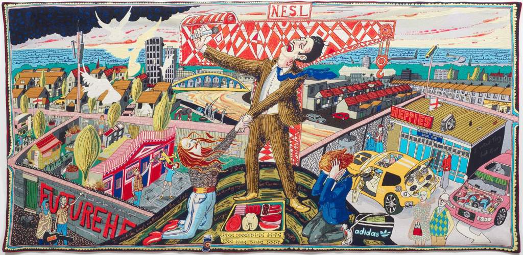
Grayson Perry
Grayson Perry’s six tapestries were created because of his fascination with taste and class. He produced these during the time that he visited three very different areas of England, where he explored the taste of the different social groups he encountered.
The tapestries tell a story of a man who was born in a working-class environment and then rose to riches and had all he desired, but then fell again.
The characters within the tapestries are based upon people Perry met while visiting Sunderland, Tunbridge Wells and the Cotswolds. Along with modern life, and those people, Perry also took a lot of inspiration from early Renaissance religious works but also, and most importantly, William Hogarth’s series of paintings A Rake’s Progress (1733), which tells a similar story of a young man who loses his fortune due to a series of bad decisions.
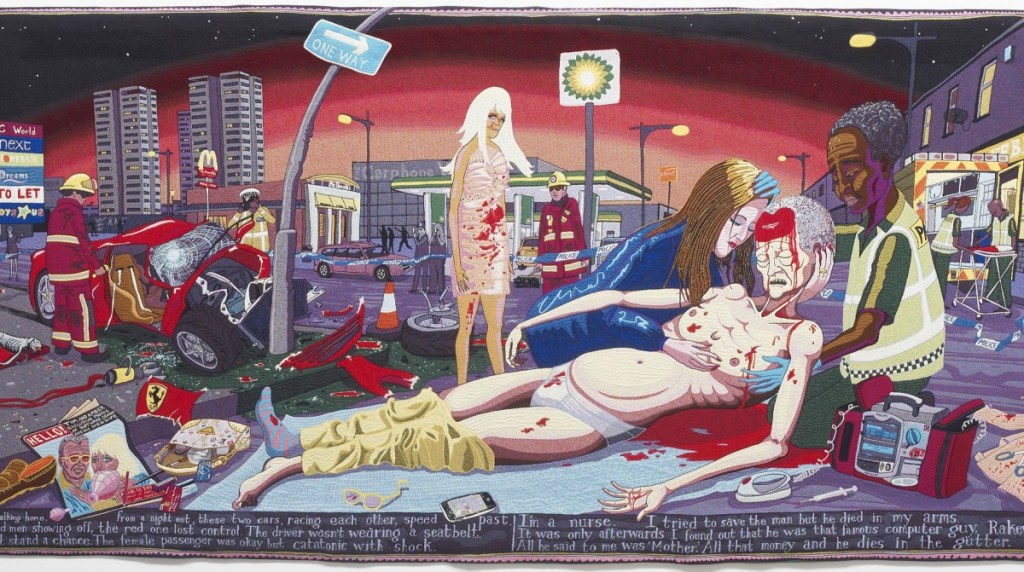
I chose the last tapestry of the six to show the final outcome of Tim Rakewell’s adventures, as he meets his end in a car crash, the emblems of his lifestyle – fancy car, Louis Vuitton bag – scattered uselessly around him. Death will put an end to everything, the tapestry tells us. Class trappings will not follow us to the grave.
‘The tapestries tell the story of class mobility, for I think nothing has as strong an influence on our aesthetic taste as the social class in which we grow up. I am interested in the politics of consumerism and the story of popular design but, for this project, I focus on the emotional investment we make in the things we choose to live with, wear, eat, read or drive. Class and taste run deep in our character – we care. This emotional charge is what draws me to a subject.’ Grayson Perry.
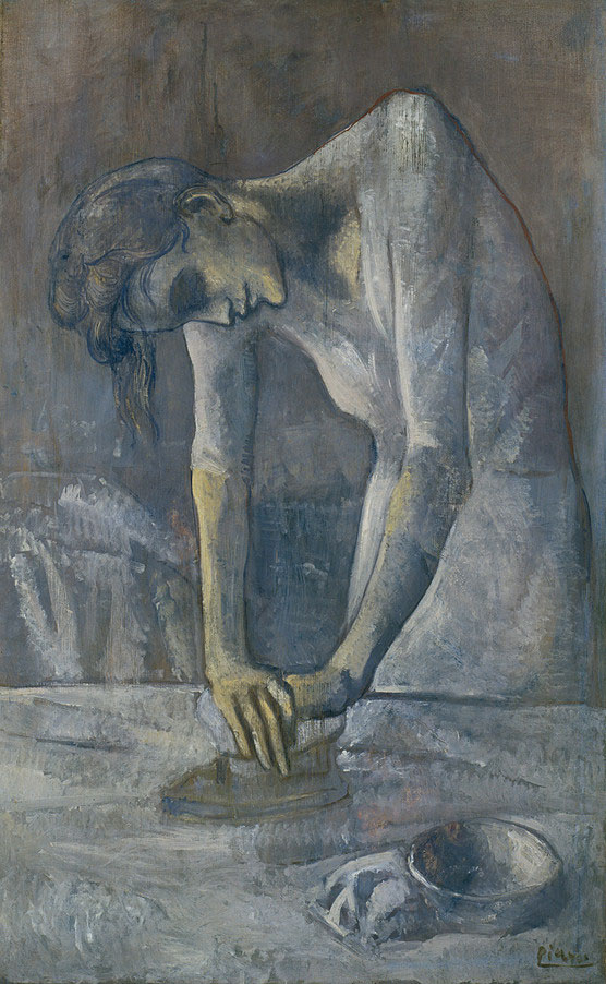
‘Woman Ironing’ Pablo Picasso
‘Woman Ironing’ was painted by Picasso during his blue period. It was painted as this period ended, meaning the colour scheme was lighter and consisted of whites and greys rather than the dark and harsh blues seen during the heart of this period.
The colours he has used, and form of the woman show poverty, loneliness, and suffering.
The painting shows a woman hunched over, pressing on an iron with all her force. Her face is tired, with hollowed eyes and sunken cheeks.
‘A recurrent subject matter for Picasso during this time is the desolation of social outsiders.’
When Picasso painted this portrait, he was 22 years old and living in Paris with very little to his name. He would often use the same canvas multiple times, abandoning one work and using the canvas again to paint over. Later down the line it was discovered that there was another painting beneath ‘Woman Ironing’. This shows that Picasso was truly painting from experience of being working class and poor.
‘Byker’ Sirkka-Liisa Konttinen
This photograph is from the extended series Byker 1969–81 by the Finnish-born British photographer Sirkka-Liisa Konttinen. She photographed working class families in the north-east of England in the small town of Byker. She showed what life was like at this time for poor families, how they spent their days and what they did for fun.
The photos have a strong contrast within them. The people in them are often happy, enthusiastic and smiling. The children are often playing and look carefree. This is in contrast with the theme of the photos, poverty. A lot of these families had next to nothing, but they are portrayed as cheery.
The way Konttinen shows the contrast is by taking all her photos in black and white. This shows the underlying message of sadness and struggling families.
This particular photograph is special to me as it is my own family. They lived in the north east of the UK, in Percy Main. They were a working-class family who also had very little at the time, so this series of photos by Sirkka-Liisa Konttinen is important to me. She saw and heard the voices of people who had never had that opportunity before.
Jo Spence
For Jo Spence, class was always of huge importance. “Given my belief that class is a dominant feature in our lives, that is where I choose to put the bulk of my work.”
Her working-class background and the class struggle was always an important area of exploration for her work, despite being looked down on because of that reason. Discussions of class in her work have been sidestepped by other writers. Spence was even asked to leave a photography collective for pressing the issue of class.
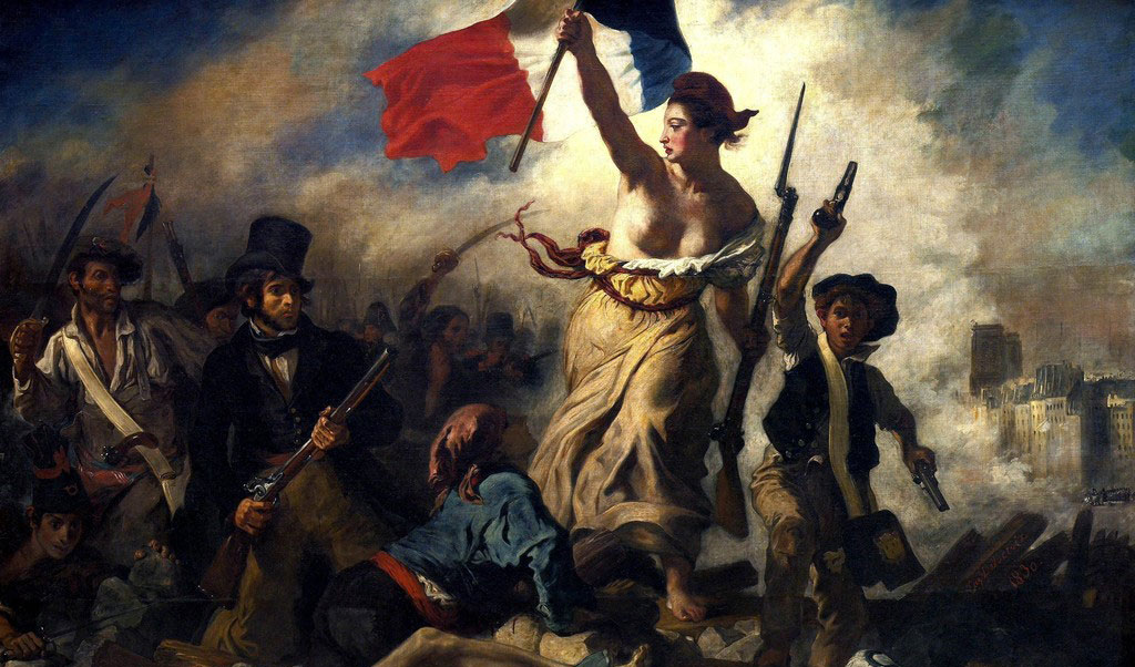
Eugène Delacroix, “Liberty Leading the People”, 1830, oil on canvas.
Liberty Leading the People is a painting by Eugène Delacroix commemorating the July revolution of 1830, which toppled King Charles X of France. A woman leads a varied group of people over a barricade of fallen bodies, holding the flag of the French Revolution, which became France’s national flag after this. The figure of Liberty is also viewed as a symbol of France and the French Republic known as Marianne. The painting is often confused for depicting the French Revolution.
Delacroix portrays Liberty as both a strong leadership figure, and a woman of the people. Delacroix uses the mound of corpses and wreckage that she stands on as almost a pedestal to show this. The painting has been seen as a marker to the end of the Age of Enlightenment, as many scholars see the end of the French Revolution as the start of the Romantic era
She is also wearing a red Phrygian cap, which the working class wore and was made popular during the French Revolution as a ‘liberty cap’.
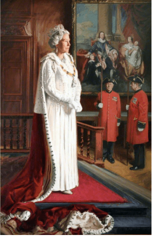
Portrait of Queen Elizabeth the Second
This is a New Portrait Painting Of The Queen By Artist Andrew Festing For The Royal Hospital In Chelsea Is Unveiled At The Mall Galleries In London, As successor to the Founder of the Royal Hospital Chelsea, Charles II, Elizabeth II is the latest in a long line of royal benefactors to the Hospital. The Chelsea Pensioners both maintain and demonstrate immense pride in the links that they enjoy to the Royal Family, as espoused in the oath of allegiance that all members of the Armed Forces swear upon enlistment.
This portrait was chosen because it shows the correlation between the royal family now and the royal family from other generations, using their huge wealth to have flattering, professionally painted portraits of themselves. Other examples of royalty who have done this would be the likes of Henry VIII, Queen Elizibeth the 1st, it seems common for royalty to still have paintings of themselves. The artist, Andrew Festing has painted the Queen in a central third, showing that the queen is at the centre of attention throughout this painting. He has also added other paintings of previous monarchies in the background to show that the previous paintings are still in use around Buckingham palace.
Festing has also made use of hierarchy by adding the queen onto steps to raise her slightly above everyone else, almost as a display of the power that she holds, adding more to the feeling of power and royalty the painting shows. He has used a deep, blood red paint throughout the painting which is a colour that the royal family have always used but is also important in this context as it is also symbolic of good health and love which could symbolise that despite her long position as queen she is still in good health and loves her country which she is passionate which can be felt through the deep reds used throughout the oil based painting.
In the painting you can see that the queen is the only person in the painting who is wearing white, she told Hello magazine that this is because: [4] “White of course is the colour of peace and the colour of new beginnings, so coincidentally the psychological meaning behind this uncommon colour choice is very fitting when it comes to renewing and celebrating diplomatic ties between different nations.” This could be in correlation with the painting being for the royal hospital of chelsea and its new beginnings at the time. She was also depicted wearing gloves which she often wears when she is out in public as she shakes a lot of peoples hands and the gloves protect her from germs but may have been added to the portrait to show us the side of the queen that she presents to the public, in addition to this she has also been painted with a tiara on alongside a golden necklace which helps to display her position of wealth and power, above all other social classes.
Our exhibition showcases the differences between social classes throughout time, but the royal family getting portraits of themselves seems to have been something that has been done through the ages, even now despite having cameras and new technology & i think that this portrait captures this well as it was painted in 1998 for the Royal Hospital of Chelsea.
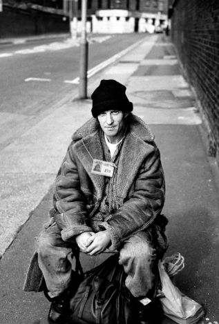
This is a photograph by David Bailey, which he took for the Big Issue magazine. This photograph illustrates the struggles of the homeless population in the UK. He does this through his use of depth of field, showing the viewer that the homeless person is the main focus in the shot but still has left room above his head so that the viewer can visibly see the street that the homeless person is living on.
The subject is surrounded by his belongings in his bags, wearing thick clothing to keep him warm whilst he resides on the street. The emotion evoked in this picture is assisted by the use of a black and white filter, as it is often used to help set a more serious tone. This could also be a reference to the fact that homelessness has been an issue for longer than we have had coloured film and photos, and that the government has had all this time to help those who are endangered on the street, but is yet to provide any funded help that has really made a difference.
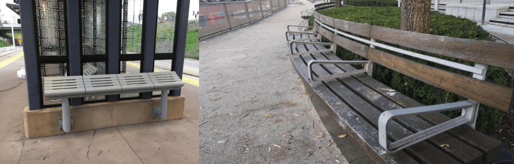
Homeless people are seen as the lowest level of the working class and are severely disadvantaged and given far less government funded support than any other of the classes. The government discriminates against the homeless population, and even uses anti-homeless architecture (also known as hostile architecture) to prevent large groups of the homeless population gathering in more middle class areas, and creating ‘unpleasant sights’ for the higher class citizens who populate those places. Some examples of anti-homeless architecture are: benches that feature arm rests to break the long slab into sectioned seats so homeless people can’t sleep there. Another example is tilted benches at various bus stations around the country, as well as spikes being added to the floor under bus stops and bridges.Instead of the government providing shelter, food and job opportunities, they choose to make sure that the homeless population stay in areas where they cannot be seen by those of higher classes, who may find their presence unnerving since many look down on them and often see them as dangerous.
Examples of Hostile Architecture:
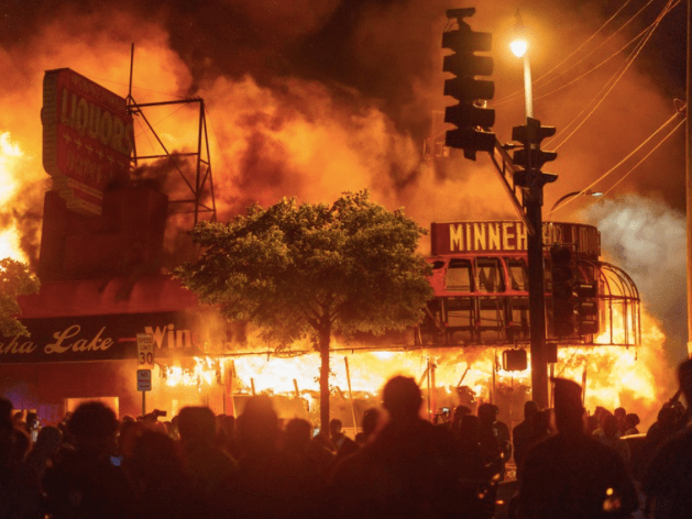
George Floyd Protests in Minneapolis [2020]
This is a photograph of the black lives matter protest in Minneapolis in 2020 after George Floyd was killed in an act of racial discrimination by a white American police officer who put pressure on his neck for eight minutes and fourty six seconds which killed George Floyd.
“On May 25, 2020, Minneapolis police officers arrested George Floyd, a 46-year-old Black man, after a convenience store clerk claimed he used a counterfeit $20 bill to buy cigarettes.
Mr. Floyd died after Derek Chauvin, one of the police officers, handcuffed him and pinned him to the ground with a knee, an episode that was captured on video. Mr. Floyd’s death set off a series of nationwide protests against police brutality.”
Although, despite research I was unable to find who took this photo, this photograph is demonstrating the outrage of the people after seeing the police brutality and how the government and law enforcement treat other ethnic groups, specifically African American people, as second class citizens and racially discriminate against them. In this photo a liquor store is in flames near the 3rd Police Precinct in Minneapolis.
This is a photo that was taken during one of the black lives matter protests in the epicentre of the protests in Minneapolis as a retaliation of the violent acts against ethnic minorities that people in power, especially in America, inflict onto people.
Whilst this is a retaliation to racial conflict in America, race and class are inexorably linked. Throughout American history African Americans have been oppressed for hundreds of years, which lead to “Higher levels of poverty and unemployment” In America the average net worth of an average of a white family “was nearly 10 times that of a black household in 2016, according to a Brookings Institution study.” This shows that they have been systematically oppressed by the government putting them naturally in a lower social class.
This photograph represents the people rebelling against this oppression, from social class to racial discrimination, they have been discriminated against for hundreds of years and ignored, while it is more extreme in America it is similar to those of a lower social class through time and around the world.
In an article by the Institute for Policy Studies they described “Yet even today, second-class citizenship continues. It shows up in generational poverty, a disparate education system, mass incarceration, and violence at the hands of police.” showing that they are treated like second class, which shows that even to this day classism is still in effect and that we are still facing issues that have been ongoing for hundreds of years.
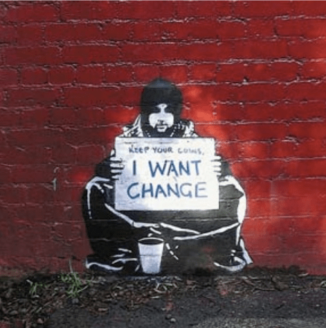
This is a piece of work created by Banksy, it was made in 2004 to display the harsh treatment of people in a lower social class such as homeless people. It is a simple painting made from graffiti, focusing less on details, only working in black and white. However, similar to a lot of his artwork the message is in colour. Here the message reads “Keep your coins, i want change.” This message was written to express his anger at the British government as well as governments everywhere, and their harsh treatment of people in society, to the point where they are left homeless and mistreated.
Banksy’s work focuses primarily on political messages, from anti war pieces to anti capitalism pieces. This artwork helps portray how the little the government cares for its people which has been a common theme in social class inspired artwork throughout time such as other paintings shown in our exhibition, such as Woman Ironing, by Pablo Picasso.
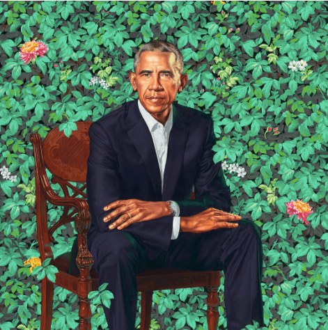
This is a portrait of Barack Obama & was painted by Kehinde Wiley. It was created in 2018, and is a near life sized portrait of Obama. The painting shows him surrounded by nature and symbolic flowers that reflect both his personal and professional history. An example of this would be the chrysanthemums which is “the official flower of Chicago.” whereas the jasmine in the painting is supposed to be a common flower in Hawaii which is his birthplace. The painting also displays african blue lilies in memory of his Kenyan father who passed away. The painting also references other presidential paintings such as the portrait of Abraham Lincoln who was sitting down in his portrait which Obama could be referencing in this portrait.
The fact that the painting is almost life size, it puts into perspective how Obama is perceived, the size of the painting influences our understanding of President Obama’s relative importance as a leader as the painting would otherwise be set to a smaller scale if he was seen as less important.
Unlike the Queen of England’s portrait, this artwork has more expression of Obama as a person and his background. It references his childhood and is paying homage to his father, which helps him be more relatable as a person since, unlike the Queen, he wasn’t born into wealth. This helps display the differences in social classes as people such as the Royal Family have always had their portrait painted, but for someone who came from a poorer background such as Obama, the portrait is a rarity and can be seen as a symbol of how far he has come. It also shows how in a short space of time he has been able to work his way so far up the social classes. Compared to a time like when Henry the VIII was in power, in the early 1500s, it would be unthinkable for someone from a working classbackground to be able to come into so much power and wealth. It further exaggerates that class is much less focused around which family you were born into, it is now more about how much money one has earned through their lifetime.
Mozilla Hubs
Now that we had annotated our chosen art pieces and put them into context, decided our layout and tested it, it was time to begin using Mozilla.
Mozilla Hubs is the website we used that allowed us to create our 3D exhibition and despite many technical difficulties using Mozilla, we finally managed to successfully add our work to our room.
We placed our chosen art pieces in the order we decided in a simple and open plan room. We decided to use this type of room to contrast with the theme we chose, which was divide and separation between the classes. We displayed our artwork in chronological order, as our theme is ‘The Evolution of Social Class:How social class has changed and adapted through time.’. We did this by placing ’Liberty Leading the People’ as our first artwork, as it shows the French Revolution, a class uprising in 1799, and Grayson Perry’s tapestry telling a story of unfortunate events, bad decisions and death, showing that money will eventually serve no purpose to us.
We also decided to have either side as the opposite end of the scale, for example, Obama’s portrait is opposite Banksy’s ‘Keep Your Coins, I Want Change’ piece, which is an image of a homeless man sat on the pavement protesting the system and homelessness.
We did this to show the contrast and ultimate divide between the incredibly rich and the people who have nothing.
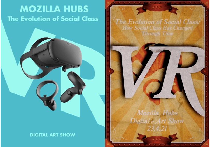
Posters
Now that we had chosen our work and curated our exhibition, we created promotional pieces for the exhibition. The information we added onto these posters were the date, our title, images of VR headsets and the location (Mozilla Hubs).
We each created a poster for the exhibition and these are the results.
Josh’s target market was the upper class. He ended up creating a more modern, clean and simple poster, which looks expensive and professional. He did this to show the side of the upper class and the rich, and to show an advertisement that they would be drawn to and therefore more likely to visit the exhibition.
My target market was the working class. I took inspiration from circus posters for my promotional poster, as the circus was the perfect example of the class divide a number of years ago. The tickets were often too expensive for working class families, meaning they couldn’t attend, or would have to sit in dirty and unsanitary seats left specifically for them. The rich would see it as a day out for their kids and pay for anything they wanted while they were there. The irony is that it was more often than not, the working class performing in the circuses, with very little pay.
