The Male Gaze and ‘The Virgin Suicides’

I have chosen to research the topic of ‘The Male Gaze’, focusing specifically on the movie ‘The Virgin Suicides’. 

The movie is almost a perfect example of the male gaze. Sofia Coppola has directed the movie using the male gaze as the whole idea, but has done so subtly. We are made to see the sisters through the boy’s eyes, but without realising. The boys use the girls for their own viewing pleasure and entertainment value but in a subtle and innocent way, one that if the sisters hadn’t tried to get help from the boys which they ignored, might not have been a problem. Sofia Coppola’s aim was to show us how the male gaze is damaging in a very different way to other movies.

I took the idea of an ‘unboxing’ video and put my own spin on it. In my video I had my actor, Rachel Double, pull a series of items out of different handbags. I chose to use handbags in replacement of a physical box since my theme is the male gaze and handbags are a stereotypically feminine thing that movie directors will use to represent women. 

The objects I included were a bikini, a lipstick, a pair of hair straighteners, a bra, a pair of high heels and a short skirt. These items are all used often to sexualise women, to show that they are there to be viewed and enjoyed by the male viewer.

Most movies that are released nowadays are directed by men and written for men. This means often women aren’t a vital part of the story, just there to be observed and objectified. 

As stated in my video, nearly 50% of contemporary films fail the Bechdel test– a simple evaluation that qualifies the film as having two named female characters who have a conversation about something other than men. This shows the male gaze is very prominent and still apparent in todays film making.

The styling of my video, and the Virgin Suicides is very important, and something I thought about in great detail. 

The styling in the Virgin Suicides is an essential part of the story. The sense of entrapment extends to their clothing. The sisters are restricted in their actions, their beliefs, their time and their clothes. Their parents are very strict Catholics, and don’t agree with the changing world in the 70s, meaning the girls have no freedom in their lives. The styles were changing to be more liberal, exciting, revealing and provocative. 

After the Sixties, where the mini skirt and other exciting styles were becoming more accepted and worn more widely, casual dress became more unisex and people had a lot more freedom, the Seventies followed suit. 

The Seventies was pretty much just a bigger, better and brighter version of the Sixties, in the sense that people were free to dress however they liked. 

Unfortunately, this was not the case for the Lisbon sisters. They were restricted in their dress by their mother, who would not let them follow the style of the century. The styling of the family included an almost neutral colour palette, with us seeing the sisters in mostly beige or white, or sometimes a very pastel and washed out version of another colour, such as mint. 

These colours are commonly associated with innocence and cleanliness, holiness and purity. In the bible, white is the colour of purity and righteousness, as well as joy, victory, and perfection. It is possible that Mrs. Lisbon, their mother, wanted to portray this with her daughters, and that is why she only allowed such a strict colour palette. 

The colour palette of the girl’s clothes is important because it is one of the many pointers that show the audience that the girls are restricted, that they are not allowed their own personalities. This is because of their mother, but within the wider picture shown by Sofia Coppola, this is also how the boys of the story treat them. They believe they are just there for their own pleasure, not as their own person. 

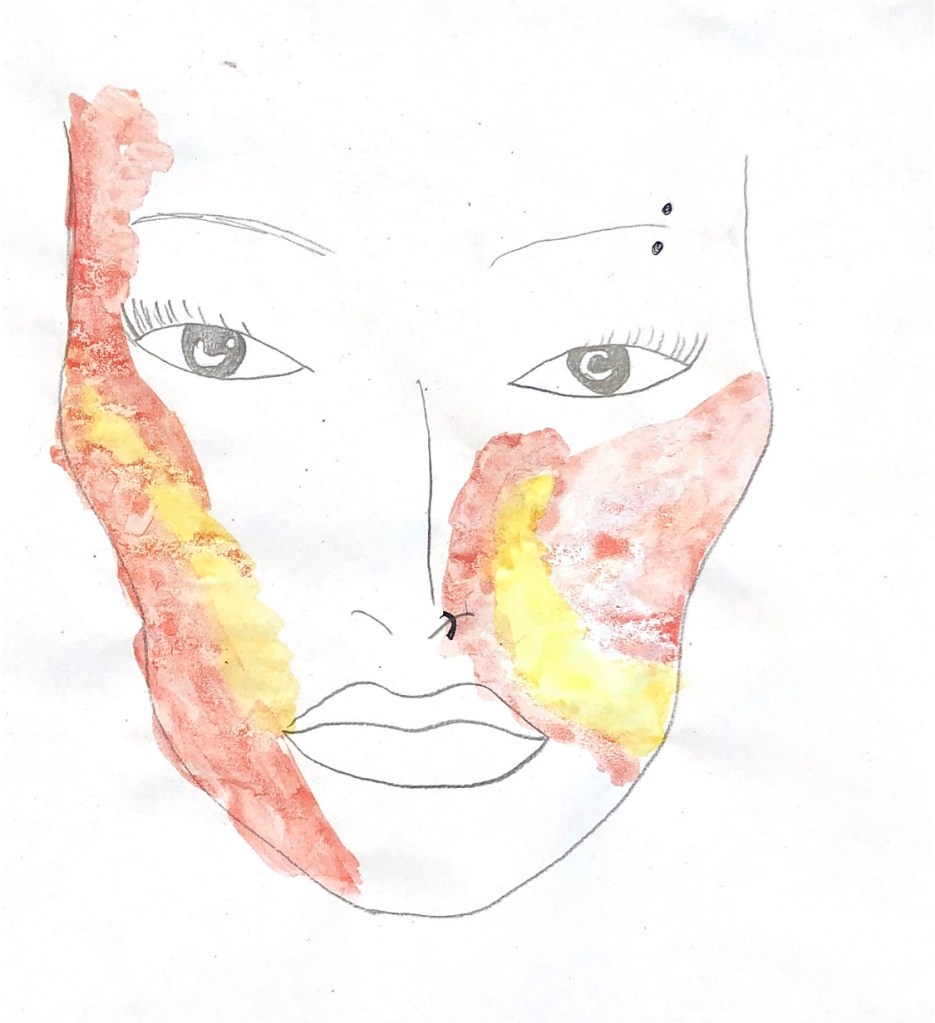
It is as if the boys are seeing the sisters through rose tinted glasses, where everything becomes one variation of the same colour. This is how they see the girls. Not as individuals, but as one entity.

The colour palette of the girls’ clothing also contrasts heavily with what the style of the Seventies was, which consisted of bright colours and interesting silhouettes. 

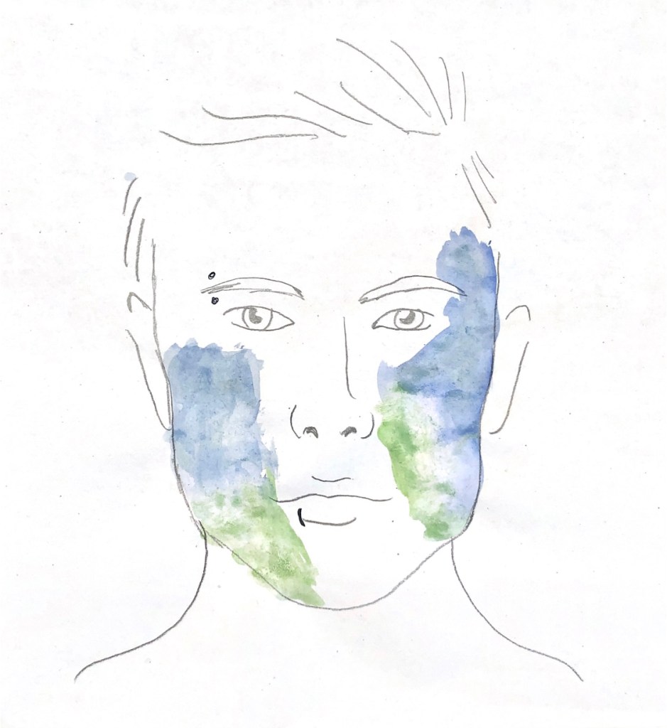
The boys in the film are shown wearing full and bright colours like red, blue and green. This is the opposite of the sisters, showing the boys all as their own people with their freedom and choice to dress as they like. 

The silhouettes of the sister’s clothes are also important. During the day they wear boxy, traditional school uniforms in grey and white again. These uniforms also have no distinguishable shape, with shirts too big for them, almost square shaped sweater vests and knee length skirts. The girls are never shown to be wearing clothes they might have picked out and enjoyed wearing, they are always wearing what someone else has told them they must wear. 

At their prom, the girls are excited to pick out the fabric and shape of their dresses to be made by their mother. Once again, they are restricted in the fabric shop, all being made to choose a very similar fabric to each other, and everything else in their wardrobes, a simple white fabric with delicate floral prints. 

The girls tell their mother how they want their dresses to be made, but to no avail. “it made no difference which pattern of their dream dresses the girls chose: Mrs Lisbon added an inch to the bust line and two to the waist and hems and the dresses came out as four identical sacks.” 

The delicate floral print shows the audience that their mother sees the girls as innocent and childlike. She doesn’t want to accept them growing up because that would mean losing control. 

It is also simple and inconspicuous. It won’t draw attention to the girls, male attention. This is their mother’s worst nightmare. 

I took all of this into consideration when styling my actor for my video. I decided to dress her in a loose white knit top with a flowy shin length skirt decorated in small flowers. I paired this outfit with a pair of Doc Martens. I chose to do this to create a contrast between the outfit and the analysis I have made. 

Doc Martens were originally made for men, for workers as sturdy boots that wouldn’t fall apart. Then, in the mid Seventies, they were adopted by punks and widely worn during that time. They were a staple in the punk era, almost the defining piece worn by all. I chose to have my actor wear these as one of the only snippets of a personality from the Lisbon sisters is when Lux is being punished and her mother burns her rock records. I think Lux would have been a part of the punk era if she had been allowed, and that is why I chose to dress my actor in these boots.

Fashion Promotion Brief

Perfume advertisement for Mowalola

Who is Mowalola?

Mowalola Ogunlesi is a 25-year-old Nigerian-born fashion designer working and living in London. She is known for working with a wide variety of textiles such as leather and PVC to produce non-traditional silhouettes inspired by Nigerian and London youth culture.

She moved to London as a child and originally planned on studying medicine but decided to study art history at CSM instead. 

Both of her parents, and her grandma, were designers. Her mother is very well known in Nigeria for her premium children’s clothing brand, ‘Ruff ‘n’ Tumble’. The brand manufactures clothing for children aged 6-16 and is very successful in Nigeria. 

Mowalola debuted her graduate collection titled Psychedelic at the Central Saint Martins Press Show in May 2017. The collection was mainly influenced by Nigerian psychedelic rock, and her pan-African approach to design is a celebration of culture, sexuality and desires.

She first showed her work at London Fashion Week as part of Fashion East for A/W 19.

Although Mowalola only showed her first collection in 2017, her clothes are being sold in major retailers, such as Farfetch, Ssense and Browns, accompanied by a hefty price tag.

She has also recently been appointed design director of Yeezy Gap by Kanye West.

Mowalola’s Vision.

Mowalola started her brand to express herself, and to help others do the same. Her core values are individuality, culture, sexuality, fun and freedom. Her clothes represent this, with their low-cut tops, short skirts, crop tops, backless tops and the use of leather. 

Mowalola’s vision is completely one-of-a-kind: through sexy, at points kinky garments she managed to convey the power of erotic tension in the times of social uncertainty. “In my country, I grew up with sexuality being very judged. So, I wanted to transform people’s ideas of what sexy is. That it’s okay to show skin”

She makes clothes that encapsulate a black African male’s sexuality, desire and attitude through an unfiltered lens that strips gender and racial stereotypes bare.

She takes inspiration from Afro-futurism, 60s-70s Nigerian psychedelic rock and Nigerian and London youth culture to create the unusual and fresh silhouettes she does. 

Mowalola uses fashion to dismantle thought patterns, particularly regarding society and sexuality. 

“Every time I get a new collection, I just ask myself: What is the world like? What do I want to change in the world? I feel the freest people can be is when they truly know themselves wholly, sexually. There are so many things trying to block that in the world, and I want people to be more in tune with themselves. If they can do that sexually, then they can adopt that to every aspect of their lives. So, with my clothes, I want to show men in a different way to the way they are perceived, especially black men” she continues. “I’ve grown up being taught to think a certain type of way about how black men should be, or how we should perceive them as quite hard and aggressive. To me, a strong man is like Prince or like Andre 3000. They can be graceful, they can be soft, they can be family men. Yet they can still be masculine, all in one. I don’t think people need to fit into other people’s stereotypes. I think challenging stereotypes is what makes you find out who you really are.”

Target audience

Who is Mowalola’s target audience? 

The young generation of London, the ones who don’t fit into societal boxes- the marginalized youth. 

How can they make their customers lives better?

Mowalola gives the marginalized youth and the minorities a voice. She lets them express themselves and their sexuality with her clothes and feel like themselves. 

They see themselves represented in her clothes, as many of them haven’t had this chance before. 

Mowalola is sharing her own and other experiences as a black person, and how she feels like being black makes you a walking target. That is where the inspiration for her infamous bullethole dress, which was worn by Naomi Cambell.

Mowalola said about the dress, “I make clothes to challenge people’s minds. This gown is from my collection ‘Coming For Blood’ – a delving into the horrific feeling of falling in love. This dress is extremely emotional to me – it screams my lived experience as a black person.”

The designer added: “It shows no matter how well dressed you are or well behaved, we are time after time, seen as a walking target. I’m in a privileged position to be able to speak on issues that others would be silenced on. Inequality is still rife and newspapers clawing at my work is testament to that.”

Afro-Futurism

What is afro futurism?

Afrofuturism is a cultural aesthetic, philosophy of science and philosophy of history that explores the developing intersection of African diaspora culture with technology. It was coined by Mark Dery in 1993 and explored in the late 1990s through conversations led by Alondra Nelson.

It is a cultural aesthetic that combines science fiction, history and fantasy to explore the African American experience and aims to connect people with their forgotten African ancestory. 

What is the purpose of Afrofuturism?

The term Afrofuturism, coined in 1993, seeks to reclaim black identity through art, culture, and political resistance. It is an intersectional lens through which to view possible futures or alternate realities, though it is rooted in chronological fluidity.

Afro- futurism is everywhere, everyday. From intricate patterning in jewellery, to abstracted forms, exaggerated hourglass silhouettes of the human figure, incredibly rich colours and above all, black pride. These are all either visual or personal attributes that are incredibly popular and valued right now.

So how does Mowalola fall into the Afro-Futuristic category?

Mowalola’s use of bright and rich colours, sexual and erotic silhouettes and political undertones make her the perfect definition of afro-futurism.

Her brand is focused on reclaiming her black identity and sharing this with the world.

“Silent Madness”

Mowalola explored her label in a different dimension with an installation at NOW Gallery called “Silent Madness,” which combined music, film, and pieces from her collection for a trippy walk through Mowalola’s surreal punk-inspired aesthetic. 

She wants “Silent Madness” to allow people to be in themselves and their minds. 

“So, now you’re in your own world, but also in my world. You still have control, but I guess I’m kind of dictating where your mind is going to end up. I kind of  wanted to give people the freedom to create their own reality in the space.”

The exhibition aims to disrupt and question preconceptions of normality whilst challenging traditional discourse surrounding African sexuality encouraging visitors to shed the pressures of convention and live life by their own terms.
Mowalola explains how she wanted to create her own version of a renaissance painting as in every art exhibition she had visited before, she didn’t feel a connection to. “Something chaotic, sexy, and unapologetically black.”

Inspiration

I was inspired by the Gucci Guilty campaign as the styling and set designs really encapsulate the feeling and essence of Gucci. Just by watching it you can instantlytell it was made by Gucci. Mowalola has a very strong brand image which is very different to any other brand I know. I would like to replicate this type of feeling of knowing without being told that it is an ad for Mowalola. Every scene of this ad is different, but it all fits perfectly together, with the casting, styling and music.

styling

I tried to capture Mowalola’s personal style, which I have analyzed from her Instagram and other social medias, and her style of designing. Her label is all about sexuality and freedom, so I chose a short skirt with an unhooked belt over the top to show that side. I have also noticed Mowalola herself wearing similar skirts to this. 
Mowalola uses a lot of animal print, and colured leather in her designs, which is why I chose the red leather bag and tiger print vest. 
To fit in with Mowalola’s roots of afro-futurism, I also used a pair of futuristic white sunglasses.

I chose to style my male model in a leather jacket, plain black straight leg trousers, and Prada sunglasses. I also chose for my model to be shirtless, as Mowalola is heavily influenced by male sexuality and the male body. I felt styling my model without a shirt would show this side of Mowalola’s brand values well.

I used a leather jacket to emulate Mowalola’s use of leather in her runway shows and within her own personal style. I also used a leather bag for the other look, to tie both together.  

Set design 

For my set design, I used 60 bin bags taped up around my room. I wanted the effect of darkness and night-time, but I also wanted to continue the theme of leather. For this reason, I decided bin bags were the most appropriate for my set. 

I also used a ring light, which I moved around while filming to capture the best lighting for each shot. 

While filming, I also used a fish-eye lens to capture the video.

Makeup

I chose to use red and yellow, and blue and green as the colour combinations for the makeup for my advert. I chose these colours as I have looked at Mowalola’s ‘Silent Madness’ exhibition, which featured these two colour combinations frequently. I also took inspiration from her A/W19 show, where she painted her models faces in a similar way and with a colour palette which is correspondent to the one I chose. I used different colour eyeshadows to get the powdered effect.

Bottle ideas

Mowalola and her brand are very focused on sexuality, freedom, blurred lines between genders, gender fluidity, masculinity and femininity. For this reason, I chose to make the bottle in the shape of a female figure. Although the perfume is unisex, the message I’d like to portray with this perfume is freedom and expression. I aim to connect everyone, especially males to their most feminine side with this perfume, and to teach people not to be ashamed or afraid of it.

Advertisements

I chose to promote my perfume in busy and bustling city areas such as Times Square. I did this because Mowalola is very focused on city life- growing up inLondon. Her target market is young men and women who live the same lifestyle as her. 

I also chose to display all my adverts at night time, as that is another thing that sets Mowalola apart; she is very much a part of the nightlife and club scenes, which reflects in her clothes.

FINAL PERFUME ADVERTISEMENT POSTER

THE FINAL STORYBOARD

Design marketing brief

Campaign for a four day working week.

When researching pro four day working week posters, the ones that stood out to me the most were the simple, colourful ones. They get the point across without bombarding the viewer with too much information at once. They easily show the pros of a four day working week without the poster being too crowded and therefore easy to understand. 

I decided my poster was also going to be bright with little information, just enough so that the viewer understands the message of the poster, while also being able to read it without much effort. 

This type of advertisement is perfect for people who are commuting to work, and in a rush. This is my target market. 

When thinking about this brief, I considered what benefits a four-day working week would include. The biggest factor when I asked others their opinions was more time. A four-day working week would make sure people have more time to themselves, to do what they want. 

When I travel on the tube, the train or the bus during rush hour, I notice the majority of people are catching up on their book, the news, their phone calls, and in the mornings I even see people doing their makeup. I thought about how people spend so long working, how they spend the majority of their time at work, or travelling to or from work. The thing that made me think about this most was; I was travelling home one day at 7:30pm, and I walked past a woman dressed in a suit, talking on the phone. I heard her say ‘have you guys had dinner yet?’. I realised she was speaking to her children, and was on her way home from work. It made me realise she clearly works long hours, and misses out on her home life with her children. This is why I want to campaign for a four day working week. 

This lead me to examine how a four day working week would benefit those people. They would have more time to themselves to do the things they want in the comfort of their own home, instead of so publicly on the tube. 

I researched past Transport for London advertisements that were seen on the tube, and I noticed the majority were very simple and straight to the point, very similar to the four day week posters I researched. I noticed a theme with the advertisements that I was looking at, and that is why I decided to emulate this with my advertisement. It is focused on the commute and how people spend it, so I chose to create a similar ad so that it would fit in with the other ads on the tube and the stations. 

I sketched a few logo designs quickly, trying out different types of clocks and watches. I tried different versions of the typical clock, for example cutting out half of the clock to make it look more abstract and interesting.

After sketching my logos quickly on paper, I moved onto illustrator. Here I played around with the stereotypical clock shape. I tried different placements for the cut, different features such as legs and alarms. I like the simplicity of these designs as they show what I am trying to portray easily, that a four-day working week is essential to provide people with more time, and that no one is meant to work as much as we do currently.

I was inspired by an hourglass for these logos. I played around with the placement of the sand, the colour of it and how it would be filled, either fully coloured or with the effect of drawing. I also deconstructed the shape, making it less obvious what it is and more abstract.  

I had the most fun with these designs. I used the template of a wristwatch to get my original shape. Then, I experimented with the eraser tool in illustrator. I erased random parts of the original design with different combinations, andreceived very different results in the end. It was interesting to see what different shapes I could create with just one simple tool. 

This allowed me to produce six different variations of the original shape. After I did this, I tried using colour. 

I experimented with colour blocking for these first six designs. I tried a new colour for each design, and only used in in one place rather than filling the whole shape.

Next I tried different uses of colour, for example I filled the watch strap and removed the black lines, replacing them with a colour outline instead. 

With these experiments I became more confident with making the logos increasingly abstract. For some designs, I took away the outline altogether and only used colour. 

My most successful experiment, and the one I would like to use as my logo is the yellow-coloured wristwatch.

Being inspired by people on the commute, I wanted to advertise using the tube. I tried using the inside of one of the carriages, and then the station. The lines on my logo ended up being too thin to be able to see with these backgrounds, so I had to produce another idea. I decided to use a map of the tube as my background, but unfortunately the lines and the colour of the logo didn’t go with that background either. Because of this, I altered my logo. I edited the outlines thicker, and changed the colour of it to red. This makes it stand out more, and makes it clear what it is.

I also added my campaign slogan, ‘give yourself more time’ along the bottom. 

I decided to also add one line of information along the bottom underneath the slogan to make it clearer and easier to understand what I am advertising. I also used Instagram to advertise as this appeals to the younger audience more. They spend more time and pay more attention to social media over a bus stop ad or something similar. 

I decided to advertise using a bus stop, billboard and the posters in the tube stations. My campaign is centered around the commute, and in particular the tube, and therefore I decided the tube was the best place to advertise. When I am travelling on the tube I pay most attention to these adverts placed up the escalator. I decided to repeat the poster in every other space, to grab people’s attention. It also allows people to take in all the information on the poster as they are seeing it multiple times. 

I then started using Adobe After Effects to edit my moving bus stop logo. I found this software difficult to use, but I managed to create the effect of the clock hands spinning.