Introduction
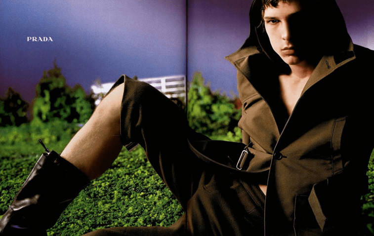
The brief for this assignment was to choose an image to recreate in the style of another creative. I chose to recreate one of my favourite Prada ad campaigns in the style of David LaChapelle. I chose David LaChapelle because his use of bright, bold and intimidating colours presented an interesting challenge for me. My end goal was to create a similar photo to the Prada campaign but with the essence of LaChapelle.
The Prada campaign already has an interesting colour scheme, with the contrast of the purple and the green so I plan to enhance it to make it more in the style of David LaChapelle.
I plan to style my model in a similar way to the Prada campaign, but I will do my model’s makeup in a bright and colourful way so it is adding LaChapelle’s style of work into my photograph.
I will go into more depth throughout my blog explaining how I plan to style my model and my set design.
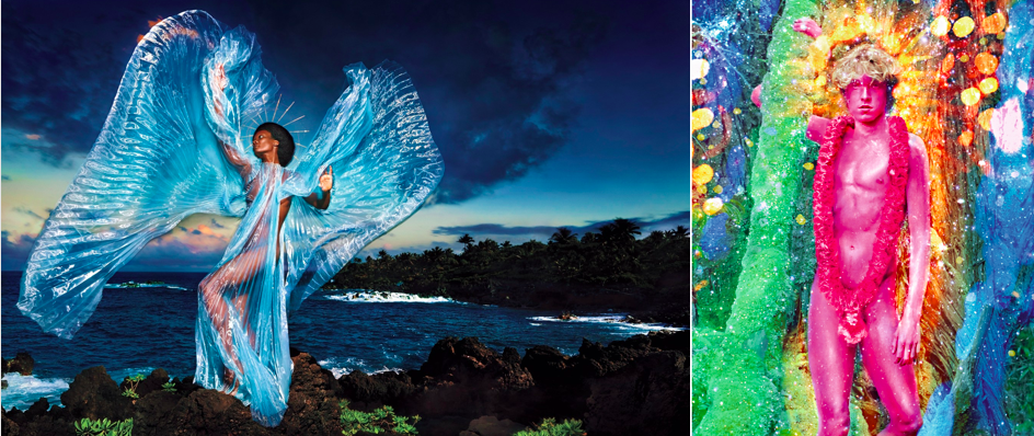
My chosen creative- David LaChapelle
David LaChapelle is known for signature bright colours within his photography, often using oversaturated and loud colours that instantly grab your attention. He uses photoshop to add more depth to his work, making his photographs look magical and sometimes even intentionally tacky. His photographs have a very pop art feel to them, reminiscent of Andy Warhol or a real-life version of Roy Lichtenstein.
When he isn’t using photoshop, LaChapelle also uses a lot of props in his work to immerse the viewer. He does this by making the photos relatable, for example using the suburbs as the location with an added twist of something out of the ordinary. It almost feels like normal but with a slightly strange and unusual twist.
I would like to try and use props in my photograph to emulate this aspect of his photography and immerse the viewer in the same way.
Props
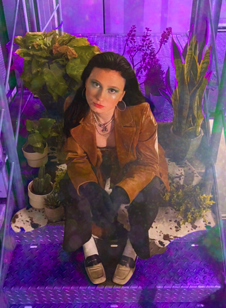
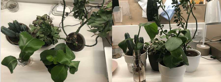
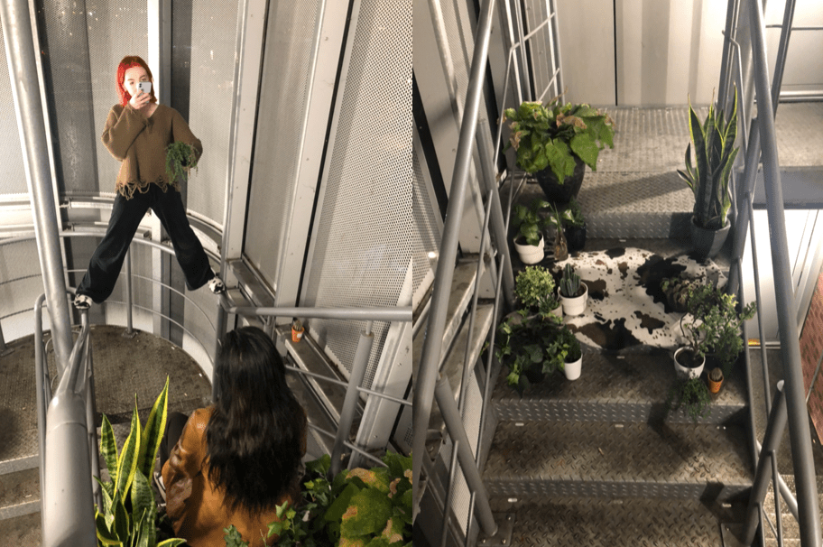
I chose to use potted plants in my photograph as the original photo looks as if it could have been taken on grass or around greenery, but in the style of David LaChapelle, I wanted to use props to enhance the feeling of the model really being involved in the background and not just being on a set.
Styling
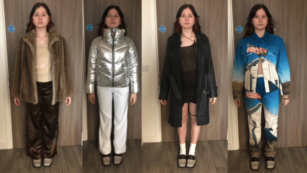
I had five possible outfits to choose from for my photograph. I chose three that were similar to the original picture I am recreating, and two that I feel reproduce Davis LaChapelle’sstyling in his photographs. The three that were similar to the original photo are more toned down, muted and consist of neutral colours. The two that I felt were in the style of LaChapelle are bright, vibrant and unusual. The main focus of the outfits and the one piece that I included in all of them were the Prada 1999 loafers. I included these as my original photograph is a Prada 1999 campaign.
I ended up choosing a more toned down, neutral outfit as I wanted to incorporate both David LaChapelle and my original photograph into my shoot.
Makeup
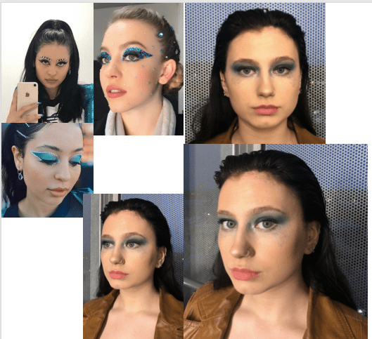
I took inspiration for the makeup from the show ”Euphoria” and runway looks I had seen in the past. I also took inspiration from editorial looks I had seen in magazines, with the colours and syle of the makeup. A few years ago the trend was a cut crease, with very precise lines and an immaculate shape. Recently, I have seen more abstract looks like the one I chose, with not much shape or definition, which is also reminiscent of LaChapelle’s photography. It is similar in the way of looking like it was thrown together, and is messy and disorgansied, when in reality, the art took a long tine and was carefully thought out.
I wanted to create an extreme, bold and colourful look for my model to fit in with David LaChapelle’s brand of colour and extreme looks. I chose to do a green and blue eye look with glitter under the eyes to draw focus to the model’s face, as I realised the background and the styling may take away from it.
I used hair gel to slick back my models hair, to bring a certain nineties feel to the look.
Set design
I chose to take my photograph in the fire exit of my apartment building because it is a very harsh and brutal environment. The steps and walls are grey coloured, made of steel and very sturdy. The lighting is bright white and piercing, which highlights every part of the model and the props.
Compared to the potted plants, the styling of the model and the cow print rug, which are all very soft and delicate, the two opposites creates a contrast.
I had the potted plants surrounding my model to try and emulate the same essence of LaChapelle’s immersive photography. I tried holding a hanging plant infront of the camera to create even more of an immersive effect.
Photoshop
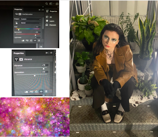
To edit my photo I used photoshop. First I used the lasso tool to select the background, without including the model or the props so I could edit the colours and saturation without including them.
I raised the saturation to +65 to recreate the look of a David LaChapellephotograph; bright, colourful, unusual and eye catching.
I also set the hue to –117 which is a yellow hue to contrast with the purple tones.
I then added an image of glitter which looked as if it was flying out of the screen over the top to carry on with the immersive effect I have been trying to create with my photograph. I then lowered the opacity of it so I just got the colours and a slight glitter effect. I used this image to create the same ‘tackiness’ LaChapelle uses within his photography.