Campaign for a four day working week.
When researching pro four day working week posters, the ones that stood out to me the most were the simple, colourful ones. They get the point across without bombarding the viewer with too much information at once. They easily show the pros of a four day working week without the poster being too crowded and therefore easy to understand.
I decided my poster was also going to be bright with little information, just enough so that the viewer understands the message of the poster, while also being able to read it without much effort.
This type of advertisement is perfect for people who are commuting to work, and in a rush. This is my target market.
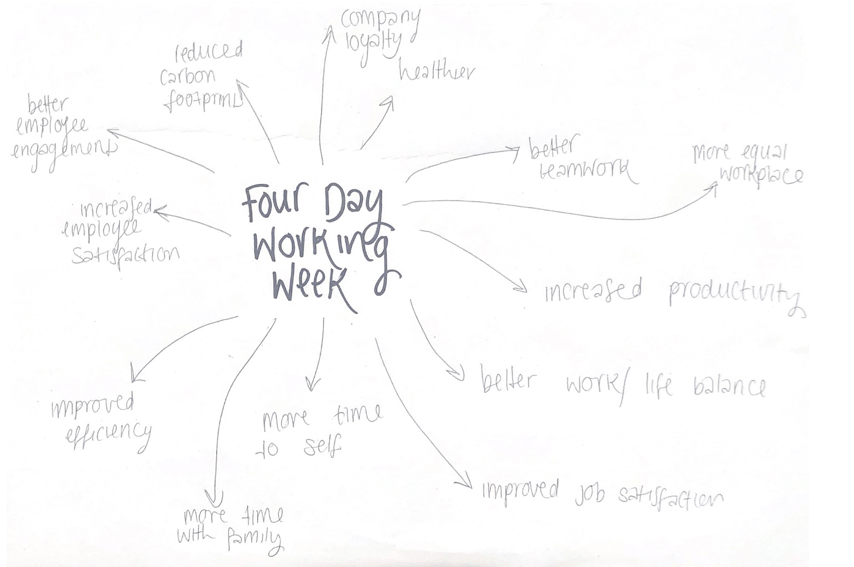
When thinking about this brief, I considered what benefits a four-day working week would include. The biggest factor when I asked others their opinions was more time. A four-day working week would make sure people have more time to themselves, to do what they want.
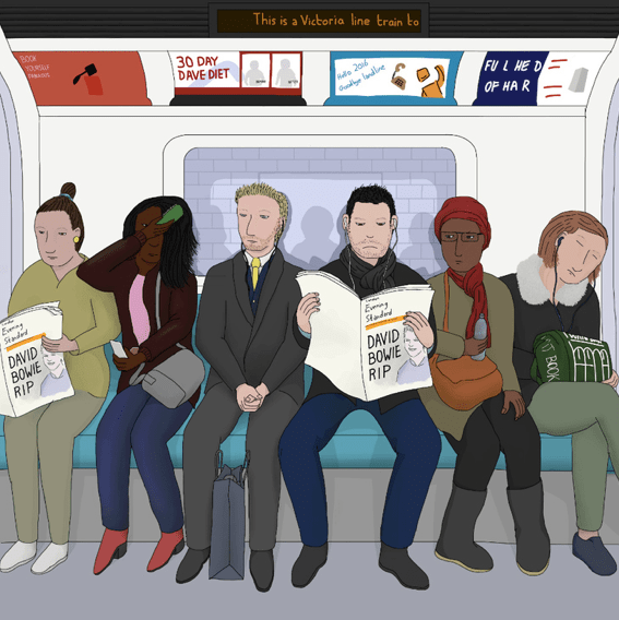
When I travel on the tube, the train or the bus during rush hour, I notice the majority of people are catching up on their book, the news, their phone calls, and in the mornings I even see people doing their makeup. I thought about how people spend so long working, how they spend the majority of their time at work, or travelling to or from work. The thing that made me think about this most was; I was travelling home one day at 7:30pm, and I walked past a woman dressed in a suit, talking on the phone. I heard her say ‘have you guys had dinner yet?’. I realised she was speaking to her children, and was on her way home from work. It made me realise she clearly works long hours, and misses out on her home life with her children. This is why I want to campaign for a four day working week.
This lead me to examine how a four day working week would benefit those people. They would have more time to themselves to do the things they want in the comfort of their own home, instead of so publicly on the tube.
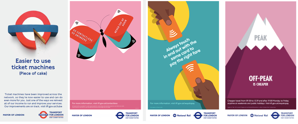
I researched past Transport for London advertisements that were seen on the tube, and I noticed the majority were very simple and straight to the point, very similar to the four day week posters I researched. I noticed a theme with the advertisements that I was looking at, and that is why I decided to emulate this with my advertisement. It is focused on the commute and how people spend it, so I chose to create a similar ad so that it would fit in with the other ads on the tube and the stations.
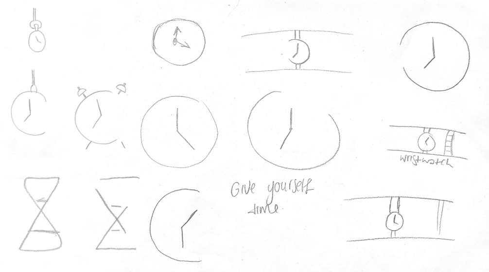
I sketched a few logo designs quickly, trying out different types of clocks and watches. I tried different versions of the typical clock, for example cutting out half of the clock to make it look more abstract and interesting.
After sketching my logos quickly on paper, I moved onto illustrator. Here I played around with the stereotypical clock shape. I tried different placements for the cut, different features such as legs and alarms. I like the simplicity of these designs as they show what I am trying to portray easily, that a four-day working week is essential to provide people with more time, and that no one is meant to work as much as we do currently.
I was inspired by an hourglass for these logos. I played around with the placement of the sand, the colour of it and how it would be filled, either fully coloured or with the effect of drawing. I also deconstructed the shape, making it less obvious what it is and more abstract.
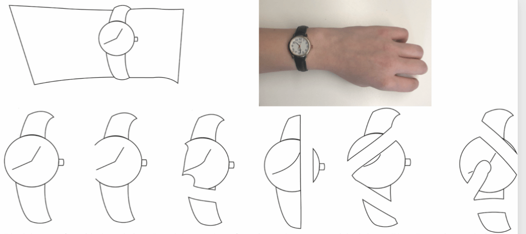
I had the most fun with these designs. I used the template of a wristwatch to get my original shape. Then, I experimented with the eraser tool in illustrator. I erased random parts of the original design with different combinations, andreceived very different results in the end. It was interesting to see what different shapes I could create with just one simple tool.
This allowed me to produce six different variations of the original shape. After I did this, I tried using colour.
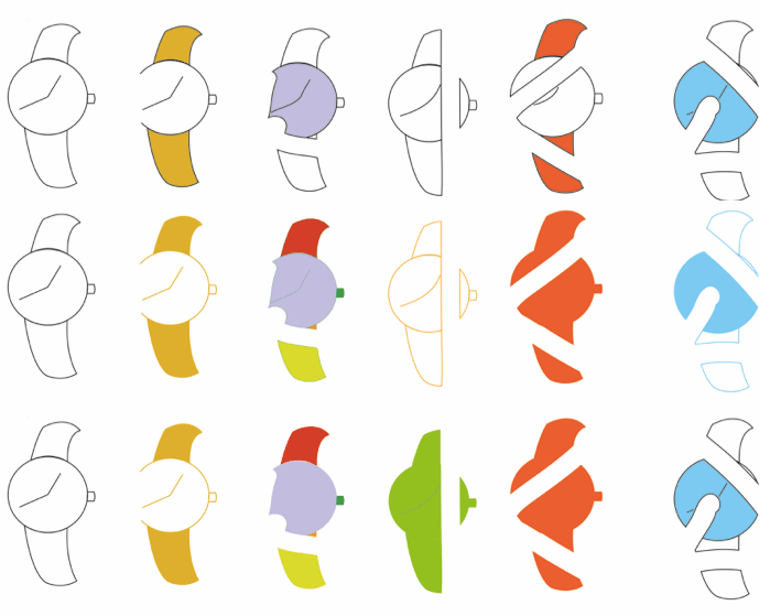
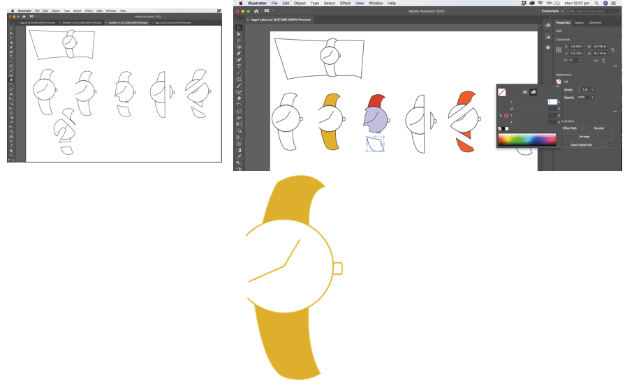
I experimented with colour blocking for these first six designs. I tried a new colour for each design, and only used in in one place rather than filling the whole shape.
Next I tried different uses of colour, for example I filled the watch strap and removed the black lines, replacing them with a colour outline instead.
With these experiments I became more confident with making the logos increasingly abstract. For some designs, I took away the outline altogether and only used colour.
My most successful experiment, and the one I would like to use as my logo is the yellow-coloured wristwatch.
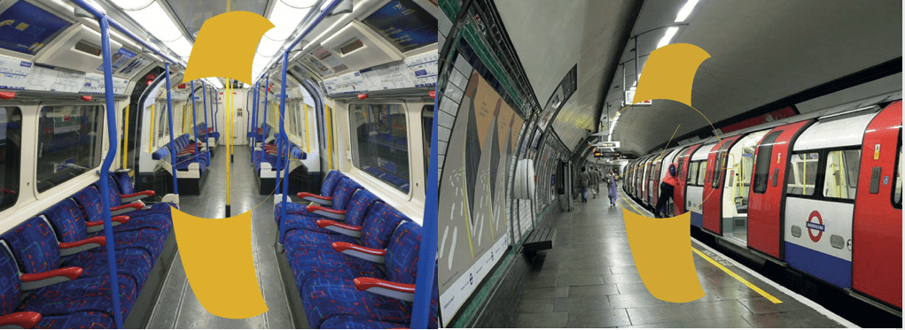
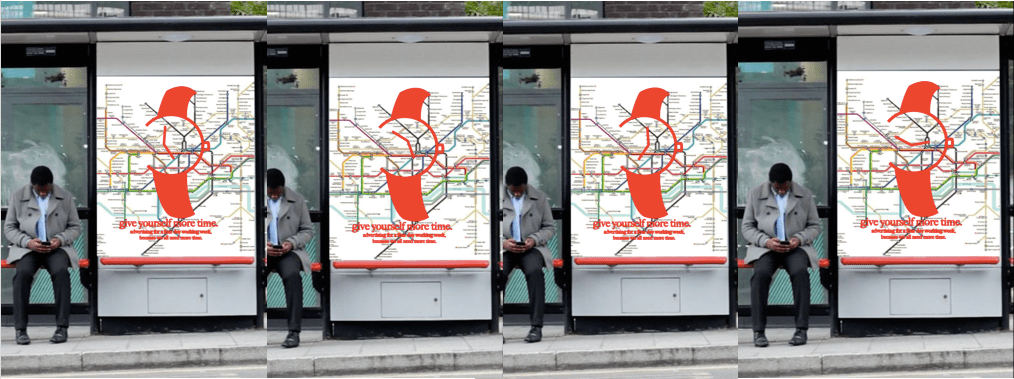
Being inspired by people on the commute, I wanted to advertise using the tube. I tried using the inside of one of the carriages, and then the station. The lines on my logo ended up being too thin to be able to see with these backgrounds, so I had to produce another idea. I decided to use a map of the tube as my background, but unfortunately the lines and the colour of the logo didn’t go with that background either. Because of this, I altered my logo. I edited the outlines thicker, and changed the colour of it to red. This makes it stand out more, and makes it clear what it is.
I also added my campaign slogan, ‘give yourself more time’ along the bottom.
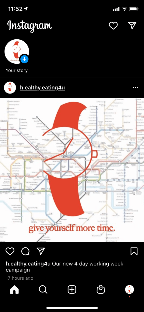
I decided to also add one line of information along the bottom underneath the slogan to make it clearer and easier to understand what I am advertising. I also used Instagram to advertise as this appeals to the younger audience more. They spend more time and pay more attention to social media over a bus stop ad or something similar.
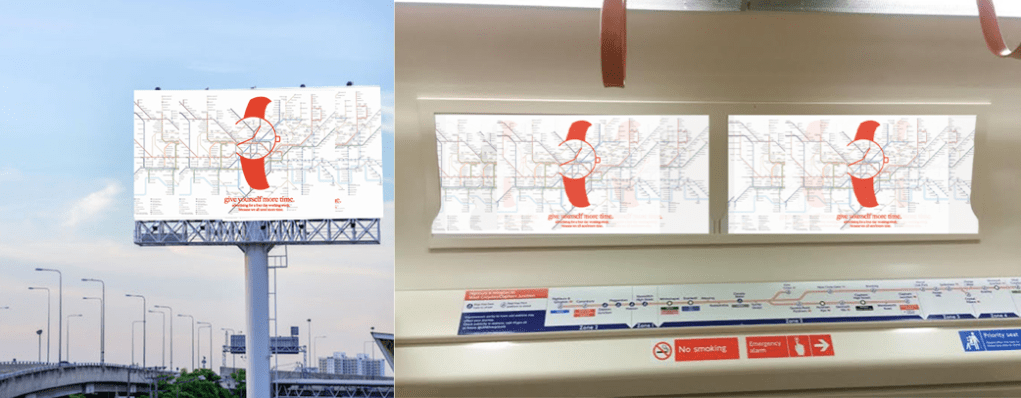
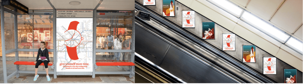
I decided to advertise using a bus stop, billboard and the posters in the tube stations. My campaign is centered around the commute, and in particular the tube, and therefore I decided the tube was the best place to advertise. When I am travelling on the tube I pay most attention to these adverts placed up the escalator. I decided to repeat the poster in every other space, to grab people’s attention. It also allows people to take in all the information on the poster as they are seeing it multiple times.
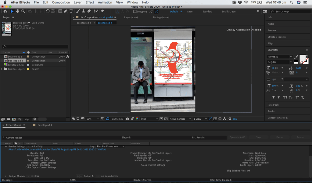
I then started using Adobe After Effects to edit my moving bus stop logo. I found this software difficult to use, but I managed to create the effect of the clock hands spinning.